Debating with data

What is Data? A character from Star Trek? Or is it factual information or numbers that can be used to help inform decision making?
Both are correct, of course. But in an era where disinformation and ‘fake news’ are playing an increasingly key role in driving geopolitical crises, it’s more important than ever that we all strive for higher standards of data and the presentation of that data. This is particularly key for the world of transport. That’s why in July 2017, the Urban Transport Group launched the Data Hub - an online, interactive tool allowing users to create bespoke visualisations of key transport data. This unique tool has proved very popular, with thousands of people visiting the hub to explore data and produce their own visualisations to help support the work that they’re doing on transport.
Back in July 2017 whilst I was at Nexus, I was working on the early stages of developing a new Bus Strategy for the region. Seeking the data to support statements in the draft, the Data Hub was able to instantly present to me the trends of bus patronage and bus trips per head for Tyne and Wear. Previously, such a task would have required trawling though spreadsheets for hours on end to get the data I wanted. The Urban Transport Group has recognised that transport planners and policy makers from across its membership were likely doing the same tasks and so the Data Hub was born, turning long spreadsheets into usable data for everyone.
When I joined Urban Transport Group on secondment earlier this year, it was clear to me that the organisation did not want to rest on its laurels. Driven by the positive experiences and constructive feedback from users, overseeing an upgrade to the Data Hub became one of my main jobs.
Select, visualise and share
The upgrade has involved two key elements. The first was working with engineers AECOM to carry out upgrades, including the introduction of Geocharts (or maps) to allow data to be paired with maps and the ability for users to add their own data to charts. The Data Hub, once loaded, should also now be faster too when creating new visualisations. The second key upgrade was the significant expansion of data that was on offer. From station entry and exit data to road safety statistics, I have spent the last few months trawling through some of the Department for Transport’s and Office of Rail and Road’s largest and greatest datasets, bringing them together in a more presentable and useable format.
Ultimately, we believe that this work has expanded the ability to ‘select’ the transport data you’re interested in, ‘visualise’ that data in graphs, charts and maps, and to ‘share’ it on websites, social media or in presentations. 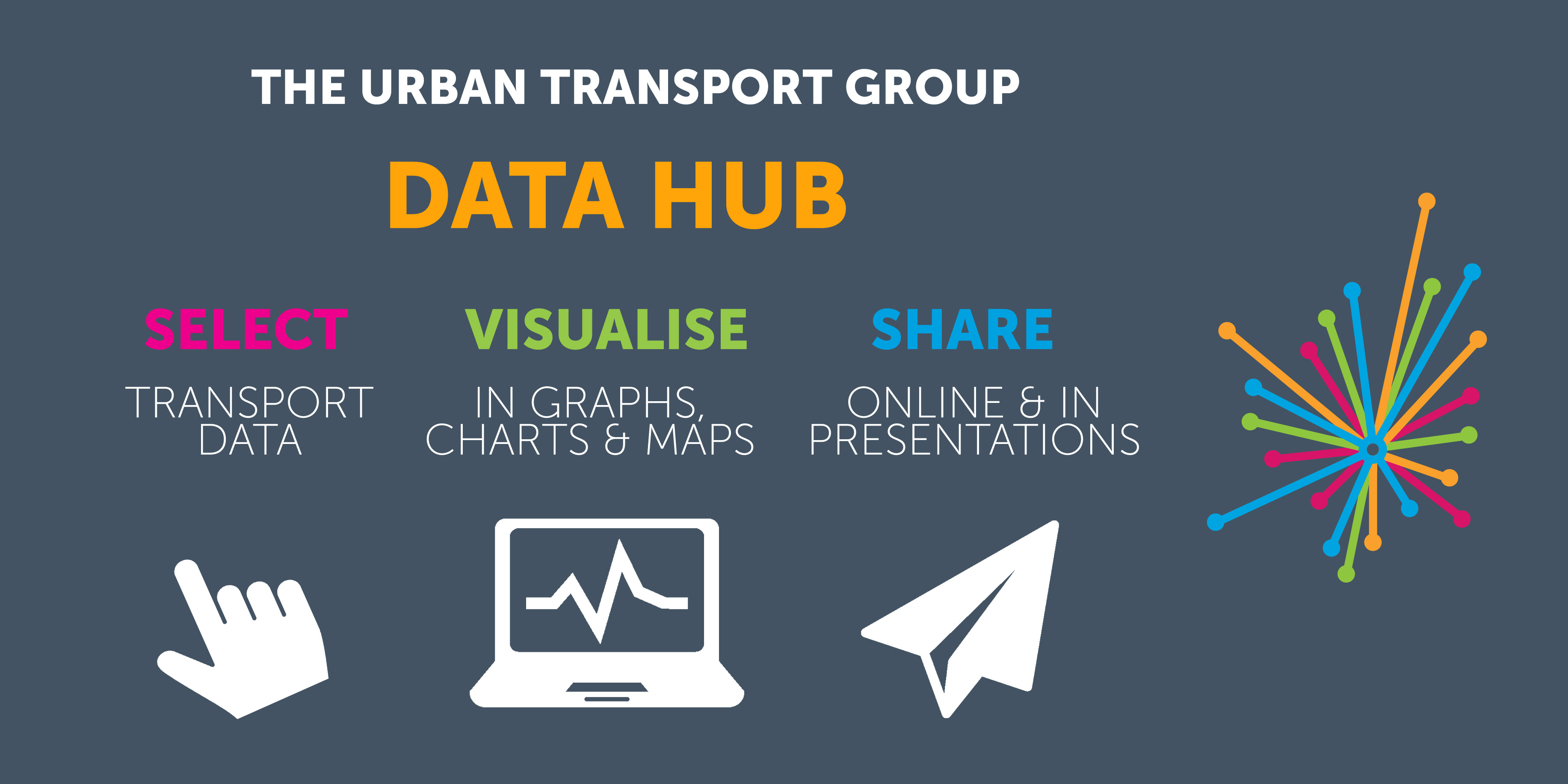 This isn’t the end though, and there are lots more exciting developments in the pipeline as we continue to evolve the tool – including even more data sets (from beyond just the UK city regions) and the ability for our members to capitalise on the software behind the Data Hub. This has been a thoroughly enlightening project to work on. I never knew there was so much excellent data on city region transport out there and I’m pleased the Data Hub will be able to raise the profile of this data.
All that is left to say, is to ask you to head over to the refreshed Data Hub and to get stuck into the new data that is available and explore the new functions we’ve added. Visualising this data and presenting it to others will help you sell your message and continue to make the case for investment in transport with accurate, informed analysis. Go on, give your work the integrity and substance that is so often lacking in today’s key debates and discussion. Debate with data!
Stephen Bellamy is Business Development Officer - Policy at Nexus, and oversaw the upgrade work to the Data Hub whilst on secondment to Urban Transport Group